Remove unnecessary elements that don’t add value
Contents
Traditionally, we have been adding loads of decorative elements to our website to make it look engaging and attractive. These decorative items might not add any usability or value to the website. Moreover, they also add on to the website load time. To be able to go for a minimalistic design, remove all unnecessary items that don’t add any value to your website. Use a copy that is succinct and concise. Plus, only include pictures that are absolutely necessary. If you need to add pictures to put your point across, consider going for illustrations-based pictures.
Simplify your website’s color scheme
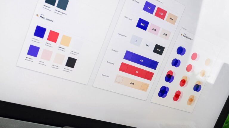
One of the biggest reasons for chaotic and problematic website design is adding a number of colors to make it look fun and approachable. This, however, complicates the design and makes navigation through the website extremely tough. The individual elements of your website might look good but when you look at the website as a whole, it looks uninspiring, boring, and dull. A good way to deal with this problem using a minimalistic website design is by simplifying your website’s color scheme.
This doesn’t mean you need to convert everything in black and white. It simply means you must tone down the range of colors used on your website. Choose a maximum of three colors that suit your brand voice and stick to these colors. A good idea is to choose at least one bold color for all important elements on your website to pop well. It is also a good idea to increase the font-size of elements in the bold color further to add a zing to the entire website’s look.
Add tiny details for an enhanced accent
Everything doesn’t have to be strictly business. When we say you must add only valuable elements to the website it doesn’t mean you can’t play around with the design. Adding tiny non-functional details can be a great way to draw attention to the important elements on the website without being too outspoken about it. This subtle drawing-in is also what subtly pushes a user further into the website.
Consider adding underlines to certain texts on your website, non-functional geometric figures, or tiny decorative items on your website. These are great to add a little extra to your website and draw attention to something important or fun and balance out the content and bring it all together coherently.
Utilize whitespace smartly
This might seem unusual but utilizing empty space or whitespace can be a great way to clean out your website and make it look professional yet fun. Whitespace is the space between any two or multiple elements in the composition of your website. It doesn’t necessarily have to be white in color. However, it is mostly empty negative space with no design elements in that particular space. This helps bring attention to the most important information on the website without distracting the visitor to unnecessary non-functional elements. Plus, it also helps balance out all the elements on the website and bring it all together well.
Create multiple text blocks
Many businesses have been adding way too much text on their website all in one go. While SEO has been the target with this, it makes the website look incredibly bulky and difficult to read. With too much text on the screen, even if you utilize headings and subheadings, it can get very difficult for your visitor to get to the valuable information. This is why you must utilize minimalistic website design and refine the text of your website.
Create blocks of text that are relevant under one particular heading. Place them on the website at regular intervals rather than throwing them all together in one giant paragraph. As a rule of thumb, keep only five important blocks of text on one webpage. If need be, extend this to no more than nine blocks. Breaking down all the important information into blocks and placing them apart from each other also helps visitors memorize and retain the subject matter. This enables you to push them towards a conversion better.
Do not use a wide range of fonts on your website
To differentiate between paragraphs or to add a little pep to the website, businesses often use way too many fonts. However, this makes the entire website look tacky and unprofessional. Plus, it can get very difficult for someone to read through so many different fonts. To be able to design your website minimalistically, ensure that you do not use a wide range of fonts on your website. Stick to one or two complementary font families and utilize them throughout the entire website. There’s no problem with using fancy fonts that speak your brand voice, but make sure that you do not clutter the website with distinct fonts.

![How to Create a Public Status Page for Your Website [FREE]](https://linuxpunx.com/wp-content/uploads/2025/10/how-to-create-a-public-status-page-for-your-website-free-768x400.png)


